Role & Responsibilities
- → Led & collaborated with 2 designers
- → Contributed to the UI component library
- → Contributed to the user research
- → Design specs & QA support
Team
- → A core team of a PM
- → Engineers
- → UX Research
- → Workday Implementers
The challenge
Due to the high complexity of composite reports, Workday implementers and Report Authors spent an extensive amount of time creating and maintaining these reports. Which resulted in low customer satisfaction and a higher cost to deliver reports. Below is a quote from of our customers that reflects the tool’s complexity and the challenges customers face with adoption.
“I need a PhD in Composite report to use it, and even then I might not be able to use it.” ~A Workday Financial customer
→ How might we substantially reduce the time it takes to create & maintain reports.
The Impact
Reduced the number of clicks from 210 to 22, and achieved a ⬇45% decrease in the time it takes to create and maintain reports.
The Process
Collaborated with research to send out a survey for Workday implementers and report authors. I helped with crafting questions to uncover:
Time spent on creating and maintaining Composite Reports
Key phases of report authoring
Top pain points
Interviewed Services and implementers to map the full reporting journey—identifying user roles, pain points, and high-friction steps. These insights highlighted where UX improvements would have the most impact.
Analyzed the current experience and completed 20 hours of beginner-level training to better understand how users interact with Composite Reports.
Contributed to the UI component library and developed impression mockups for 9 key areas identified through research, preparing them for a prioritization exercise and sparking team discussion.
Facilitated a prioritization workshop with research help where users ranked ideas based on time saved & pain points addressed, helping us define MVP priorities.
Focus and led the design for “prompt”, one of the highest-ranked and most complex features in the project.

Research
Quantitative Data

Research
User Journey Map
Design Kick Off
Deeper User Experience Analysis

Prioritization Exercise
Impression Mockups

Centralized Prompts
My Focus Area
Sneak Peek Design
Centralized Rows
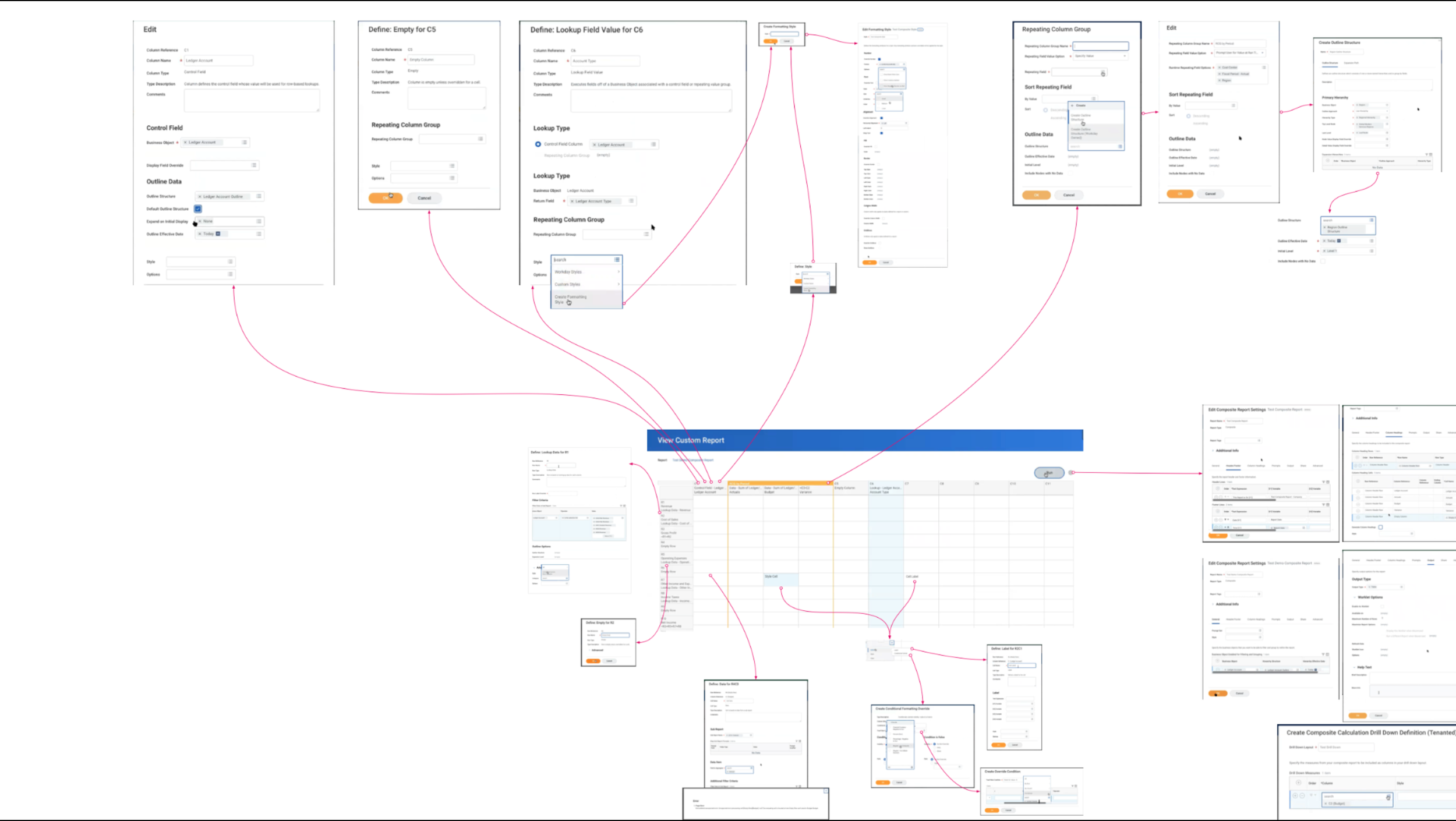
Edit All Rows was a top-ranked feature based on both time saved and pain reduced. I collaborated with two designers to redesign this experience with the goal of centralizing configuration for key elements—including rows, columns, cells, prompts, and column headings—to simplify change management while working within the constraints of an existing legacy framework.
Below highlights the before and after states, demonstrating significant UX improvements, including a substantial reduction in clicks and the time required to create a report.
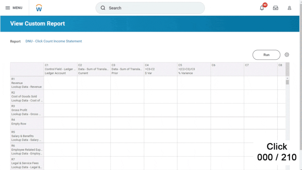
Before
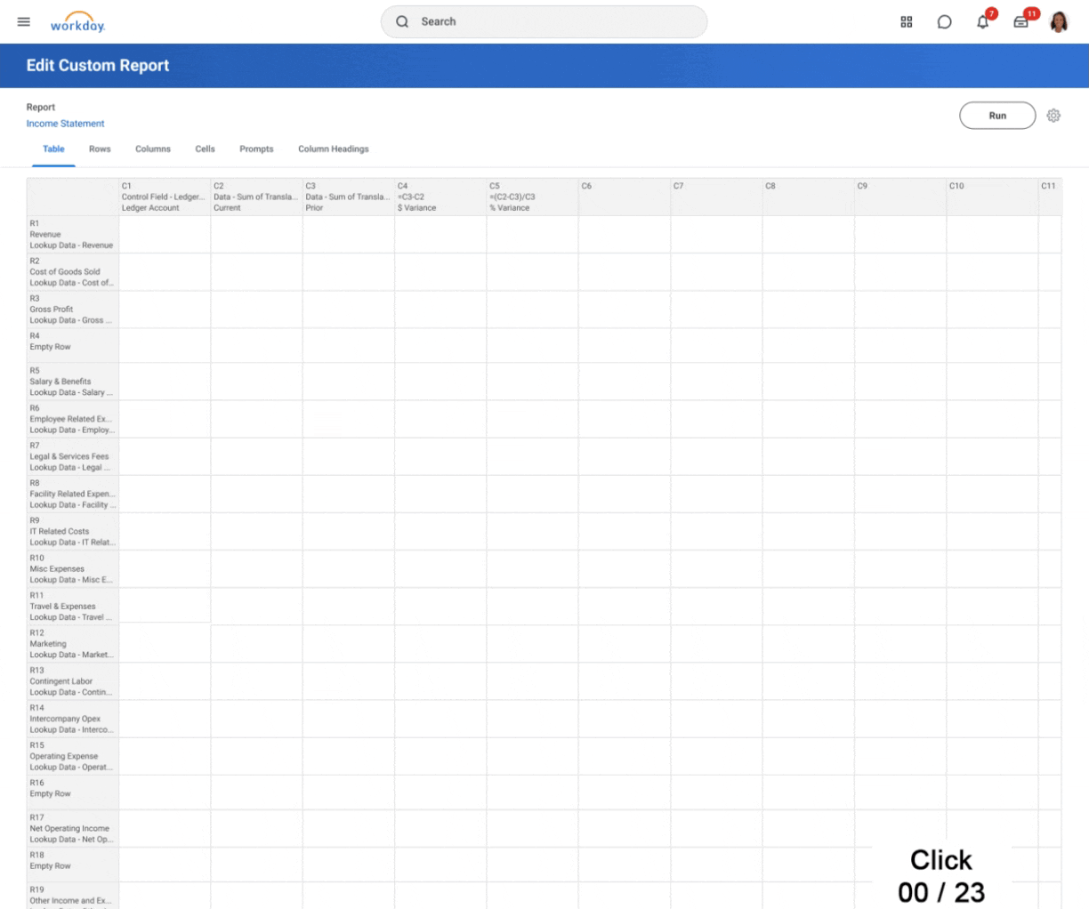
After
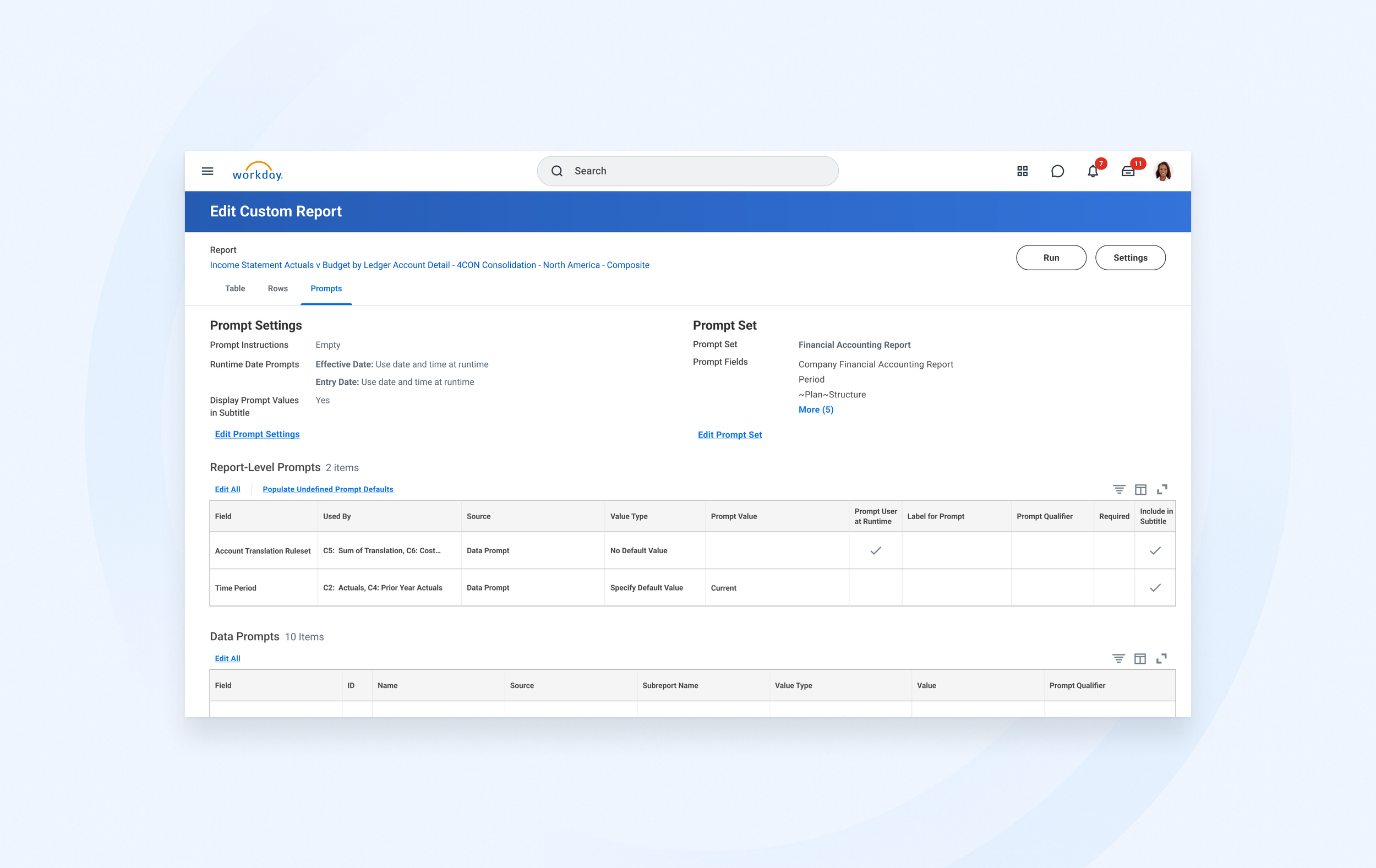
Centralized Prompts
Another top-ranked feature—high in both time saved and pain reduced—was “Prompts.” Prompts function like filters, helping users narrow down large volumes of data within a report. Since reports often contain extensive datasets, prompts allow users to tell the system, “Only show me the part I care about”.
I was assigned to lead this effort from design through delivery, including supporting engineering and QA. To maintain consistency with other features like centralized rows and columns, I applied a similar approach by summarizing key prompt information within a single, unified view.

Design Highlights
My main focus were on centralizing Rows and Prompts. The final designs were informed by insights from over 10 design feedback sessions, both large and small, as well as ongoing collaboration between the PM and UX teams.
Centralizing Key
Information
We set a goal to centralize key information and introduce tabs for
each essential element: Rows, Columns, Cells, Prompts, and Column Headings,
to make it easier for users to view and make changes.
Design Challenge: Working within the constraints of a legacy tech stack and existing
table- and form-based interfaces, with limited opportunities for design innovation.


Centralized Rows Tab:
Add a new row
I started with a centralized “Rows” tab, where users can now clearly see each row and what it represents. We introduced dedicated sections for every row type, allowing us to display relevant information for each one. Users can also add new row types directly and place them wherever they want—new functionality they’d long been asking for. This made the experience significantly more intuitive and efficient.
Centralized Rows Tab:
Edit Rows
Instead of clicking into each row individually, users can now edit multiple selected rows at once or make changes to a single row using the “Actions” menu.

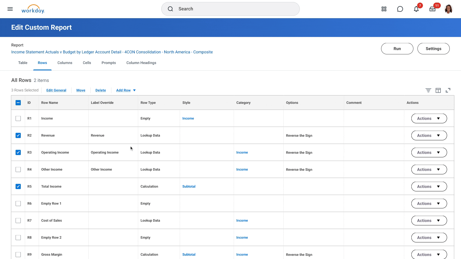
Centralized Rows Tab:
Move Rows
One of the most requested features which previously not supported, was the ability to reorder rows. I went through multiple rounds of iteration to find the best way to implement this. In the end, we landed on a simple, intuitive solution: allowing users to specify whether they want to place a row before or after a selected row
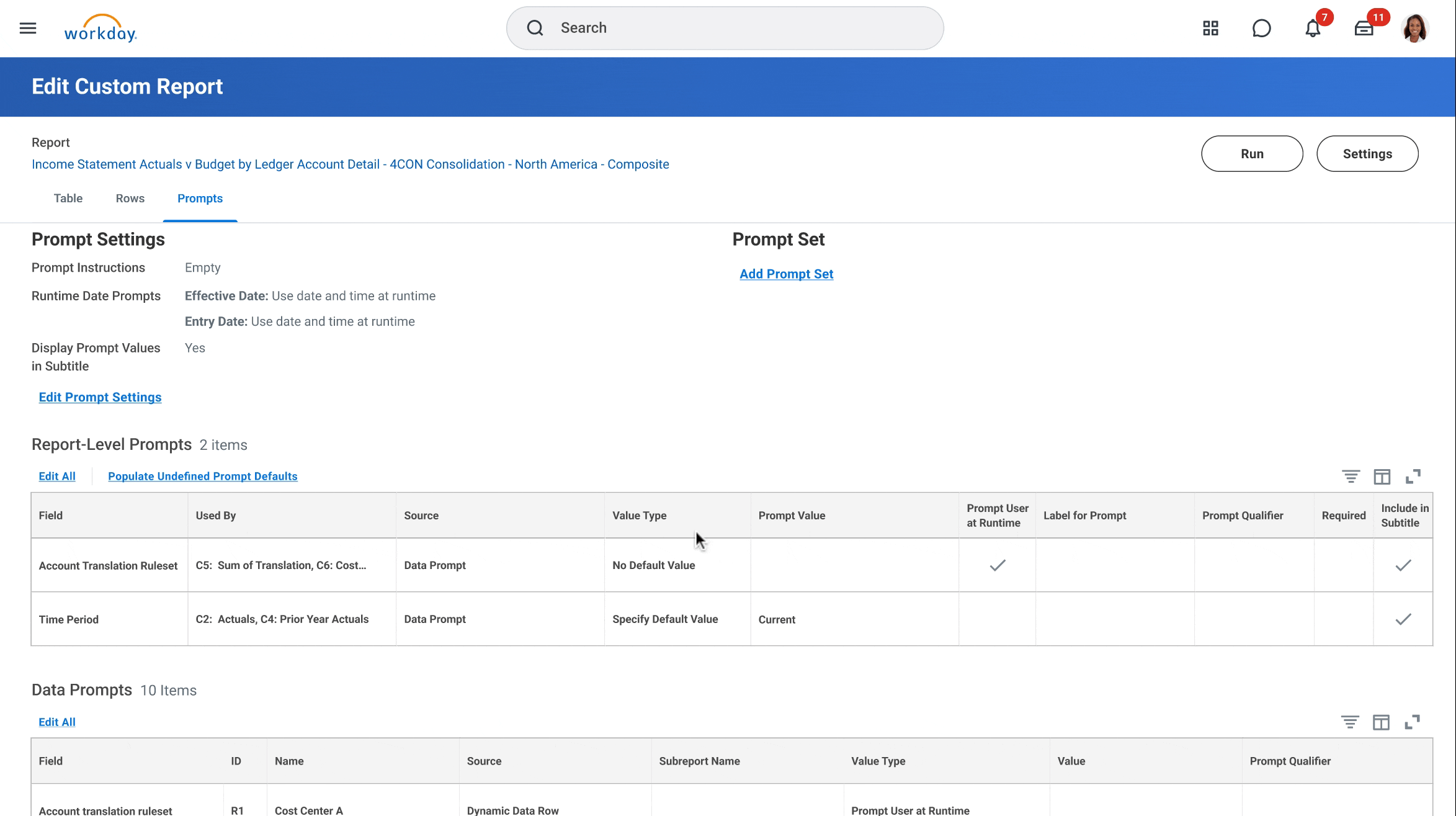
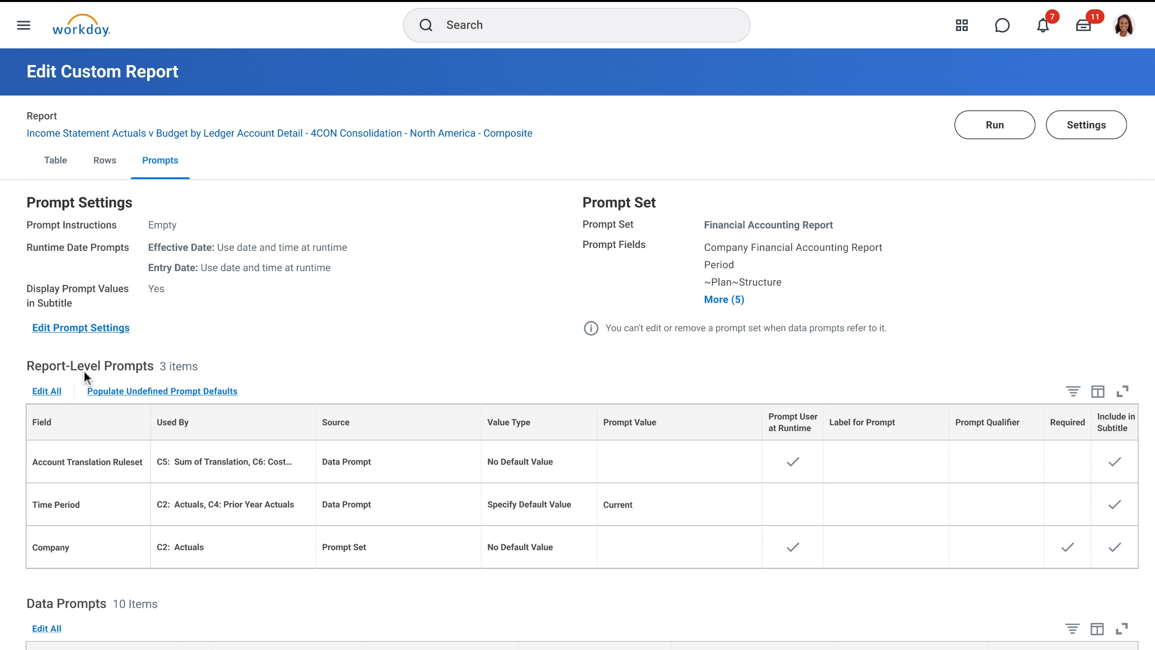
Centralized Prompts:
Problem Understanding
Prompts act as filters, helping users quickly zero in on the data that matters most in large reports. The problem was that, there were 3 different places within a composite report where users set up prompts : Sub-report prompts (defined outside the composite), Data column or row prompts, and Report-level prompts, and this resulted in disjointed experience

Centralized Prompts Tab:
Edit Column Prompts & map to a Prompt set
Just like we centralized Rows, we also reimagined the Prompts experience. Setting up Prompts was previously one of the most painful parts of creating a Composite Report due to the disjointed and scattered workflow. To address this, we introduced the “Data Column” section, which brings together all Prompts used across both columns and rows into a single, unified view.
We also incorporated the Prompt Sets (a pre-defined groups of related Prompts), allowing users to easily map individual Prompts to inherit values from the set. This not only streamlines setup but also reduces number of clicks needed to configure Prompts individually.
Impact
220 → 22
A reduction in number of
clicks to update rows or columns
↓45%
Reduce time to create
& maintain reports
↑50%
Increase customer
satisfaction