Intro
-
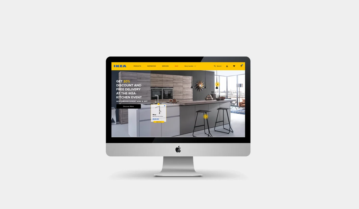
I love Ikea’s products. Although I enjoy shopping at the IKEA'S stores, don’t have a satisfactory experience when it comes to online shopping. Having a helpful and usable website is essential for any E-commerce retails, so the challenge for me would be is to make the users have a great experience while they’re engaging with the products.

Kick off
-
User Testing on Current Ikea’s Website
To provide the inspiration, guidance, and validation of how smooth the process of online shopping at IKEA goes, I decided to pick five potential users and assign them a specific task. I observed and recorded a video of them as they were going through the process of shopping to see where they struggled.
Below is the result of user testing. The red and green areas respectively represent the difficulty and easiness of the process for the users.
Designated task: Pick 1-drawer chest in brown and go through the checkout process
Heuristic Evaluation Analysis
To go even deeper in finding the fundamental problems of the IKEA’s website, I used the 10 Heuristic principles. I found this method essential for E-commerce website which can isolate a lot of usability problems before they ever become problems.
Define the Problem
-
Affinity Diagram
After reviewing the data that I gathered from my observation, user testing, and the heuristic evaluations; I jotted down each problem onto a post-it. Then I used affinity mapping to group them into categories on the wall. And finally, I narrowed down to six real issues.
Problem Statements
UI Style
1. Crowded and overloaded information: It’s hard to draw the user’s attention to important features of the page
2. lack of visual hierarchy:wrong choice color for some text or buttons make the readability difficult for users
3. Absence of brand identity:You can barely see the beautiful primary colors of Ikea brand throughout the website.
Main Menu/Product Category:
1. No hover state on menu items
2. Disorganized Category:There are too many words and categories too choose from, and many of them are redundant. the category is displayed similar to a “filtering” feature. The number of categories on one page and lack of a smooth flow within menus can be overwhelming and confusing to the users.
3. Complicated sub-menu:Navigation through the submenu is done in two ways: clicking on the tabs at the top, or selecting one of the pictures below. However, some categories that exist within the pictures are missing within the tabs. This inconsistency can be confusing to the users.
Filtering
1. Lack of consistency: The filtering style is different from page to another
2. Missing the Important Filtering Options:The filtering does not allow you to have multiple choices. In some cases, the demanding features for a product are not considered in the filtering. Therefore some users had to spend too much time to browse the specific product from the massive selection of the product lists.
Checkout
1. Inconsistent and un-user friendly process flow: They way the “Begin to Checkout” process page designed was not easy to follow for users; they missed the important info due to the lack of proper arrangement; most of the info is not in order.
2. Dearth of help information:The “Begin to checkout” was the most problematic part which did not help users diagnose form the error. The “checkout” button is initially locked unless users enter the zip code area to calculate the cost of delivery( This section is placed in an invisible part of the page). This made users confused and spend too much time to find out the problem.
Product list
1. Poor hover functioning: Via hovering over on a product, the bottom product is hidden.
2. Redundant information on each product list: Some essential options such as “Color” for displaying is forgotten, and instead, the Unnecessary feature such as dimension which takes a lot of space is substituted.
3. Missing some Helpful Information: Ikea's website is mission some beneficial sections of “Recently View”, “Similar Items”, or even Quick look.
Product Details
1. Wrong choice of word for important call-to-action buttons: Unlike other e-commerce websites which have the standard terminology for call-to-action buttons, Ikea is slightly different in this regard. Most of the users were confused by the wording. For instance, they clicked on the “Add to Shopping List” to add the product to the shopping cart. However, this button was meant to be as a wish list (standard for other e-commerce).
2. Lack of Visibility of system status: No number indicator will appear after adding a product to the shopping cart. Some users were confused if their product was added to the list or not. In other words, users needed to make sure if their action were applied to the system or not.
Design goals: Enhancing the efficiency of online shopping for IKEA to make the of process shopping easier and relatively less time consuming for customers. This would be along with giving the IKEA’s website a new look and making it on brand.
Ideations & Iterations
-
Ideation
The sketching part has always been the most fun parts of the project for me because sketching on a paper gives a lot of freedom to the flow of my thoughts without too much concerning about the details. I came up with the multiple design solutions for each of the pain points.
Iterations
Design is fundamentally an exploratory approach. It can never reach the goal in a single attempt. In each iteration, the design is moving closer to the shore as in a self-correcting process.
Design Solution & Validation
-
I used Sketch to create the Low and Hi-Fi mockups of my proposed solutions. Throughout my design process, I also tested the mockups with five new users and assigned them the same task. Below are the Low and Hi-Fi mockups of my final solutions including the results of the new user testing with my final design solution.
New User Flow
Lofi Mockups
Final Design
UI Style/ Home Page:
1- Arranged the information for a clean look and an easy to follow UI.
2- Focused on incorporating IKEA’s primary branding colors (Blue and Yellow) throughout the design of the pages. Used a contemporary style layout and typeface to create a more modern look.
3- Redesigned the homepage, as the most influential page, in a way that it draws users’ attention and motivates them to shop more via IKEA's online website.
4- Made the promotional section of the homepage more noticeable and accessible by making the products clickable and purchasable directly from there.
5- Redesigned and substituted the old-fashion call-to-action buttons with contemporary substitutions
Main Menu/ Navigation
1- Created a colorful and eye-catching menu using IKEA’s branding colors.
2- Added sub-categories that expand as the user hovers over each item for ease of navigation through the Menu.
3- Eliminated redundant hyperlinks within the navigation bar and main menu list.

Product List Page
1- Enhanced the filtering, sorting, and searching functions.
2- Added item “type” as a sorting option within the search tool to assist users find their desired products quicker and more accurately.
3- Remove the unnecessary information and reduced descriptions to a few simple bullet points to avoid having clustered and overwhelming pages.
4- Added a “Recently Reviewed” section to help users navigate back to a product they’ve shown interest in.5- Dedicated the hero image section of each category for Promotional offers.
6- Added a “Quick Overview” that expands as the user hovers over each product in the list to enable users to acquire additional information about each product without the need to navigate to a different page.
7- Fixed the filtering features within the product list pages so that users can always have an easy access to these features regardless of how far down through the page they are
Product Detail Page
1- Improved the visibility of system status. Added the number indication along with the small successful notification for “Add to Cart” and “Wish Favorite” icons within the navigation bar.
2- Substituted the wording choice for call-to-action buttons respectively from “Buy Online” and “Add to Shopping List” to “Add to Cart” and “Add to Wish Favorite” in order to be more understandable for users. Organized the information so that they look cleaner and easy to follow.
Checkout process
1- Rearranged the information and grouped them into a separate section to help users have a smoother checkout process and avoid confusions.
2- Decreased the number of steps to the final checkout as much as possible in order to make it a more efficient and satisfying experience for the customers.
Below is the new result of checkout user's flow:
Final Prototype
-
I used InVision to create interactive prototype for user testing and demonstrating how the final design will look like when it goes live. Click the link below to test the prototype!
